CleanHub works to prevent ocean-bound plastic pollution by establishing waste disposal systems in regions like Indonesia, India and Tanzania, where formal waste collection infrastructure is lacking. In this two-week project, we explored ways to make CleanHub's mission more accessible to individuals, not just businesses. We researched the company's structure, values and market position while identifying the ideal persona for a new B2C self-service model.
Role
UX/UI Designer
Team
3 UX/UI Designers
Date, duration
2025 January, 2 weeks
Tools
Figma, Figjam, Notion, Google Forms
Research
Our research phase began with a stakeholder interview with Ifigenia, CleanHub’s Senior Product Manager, who provided insights into the company’s waste collection process, AI-powered tracking app, and dashboard structure. Transparency emerged as a core value, with CleanHub striving to build trust through clear, engaging digital experiences.
To better understand potential individual supporters, we conducted a survey with 38 respondents and 7 follow-up interviews. The findings revealed a strong desire for transparency:
78% of participants considered it the most important factor when contributing to plastic reduction efforts,
followed by educational content (67%) and visible impact (64%).
Additionally, 92% of respondents actively try to reduce plastic waste, with key motivators being personal impact, updates, stories, and statistics.
These insights guided our design decisions to create a trustworthy, engaging experience for individual contributors.

Persona
Evan represents the core insights from our research: a young father in his 30s from Berlin, navigating the balance between sustainability and parenthood. While he once actively volunteered for humanitarian causes, fatherhood has made it harder to contribute his time. Concerned about his son's future, Evan is motivated to support environmental initiatives financially—but he hesitates due to uncertainty about where his contributions go. His need for transparency and trust became a key focus for our design decisions.

User journey map
A father’s guilt and search for change
Evan watches his son play joyfully with his new plastic toy train, but a wave of guilt creeps in. Memories of Bali’s plastic-covered beaches resurface, reminding him of the environmental impact of everyday items. Determined to take action, he searches for organizations fighting plastic pollution and discovers CleanHub’s blog. The stories inspire him, but when he visits the website, it feels business-focused. Despite his motivation, he struggles to find a way to contribute as an individual. Disappointed, Evan leaves the site—his desire to make a difference unfulfilled.

Problem
statement
His frustration while looking for a subscription model served as our starting point to craft an onboarding experience for individuals, leading us to this problem statement:
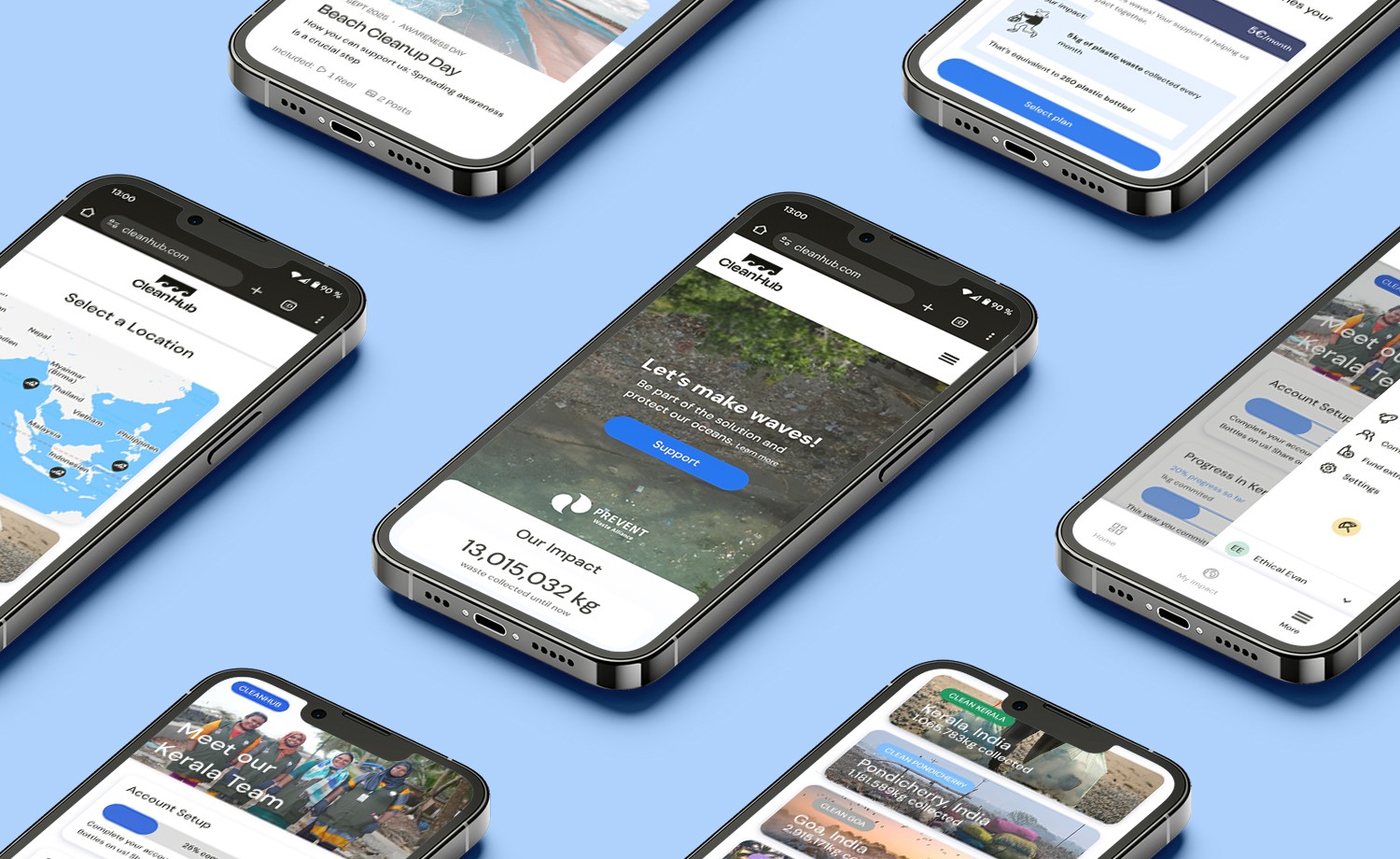
MVP
Our Landing Page and Onboarding process was designed to achieve:
Highlighting the positive impact of CleanHub (sustainable aspect of creating jobs, certification, audits) and the importance of individual contributions, conveying a trustful and hopeful image and make users sign up.
Encourage our users to engage with CleanHub further by completing the onboarding to unlock new features, mainly the option to direct your contribution to a specific project and track its progress.
Redesign the dashboard to show only the relevant information to the user about the selected project.
User flow
The biggest challenge of the project was to create a concise user flow. It took a couple of iterations until we all agreed on a version we all found fitting, but we only finalised the user flow after the Usability testing. After reading the blog, the user signs up, learns about CleanHub’s values and selects a contribution. Upon payment, they gain access to a dashboard where they can track the impact of their donation and choose which CleanHub project to support.

After completing the screens in low-fidelity, we conducted Concept testing. Due to time constraints, we only tested with 2 candidates. The testers’ responses were mainly related to copywriting, so we adjusted the headers and instructions.

Mid-fidelity & Usability testing
Once all frames were done in mid-fidelity, we ran Usability testing with the stakeholder. Based on her response, we significantly reduced the amount of screens (from 5 to 1) for the onboarding to avoid dropout. On the landing page we highlighted the importance of ocean protection, the verification of anti-greenwashing, audited by TÜV SÜD and the social impact of new jobs provided.

High-fidelity prototype
Conclusion
Project scope: The initial goals from the brief were broad, making it difficult to define clear direction early on. We had to focus on narrowing down objectives and finding a balance between stakeholder needs and user-centered design.
Surveys and interviews: Collecting sufficient survey responses from the right audience was tricky—many responses came from peers, not potential customers. Scheduling interviews across time zones created delays.
Research: Aligning our research findings with stakeholder interests was challenging. We overcame this challenge in the end because discovering the users’ struggle with plastic certificates and the uncertainty of contribution helped us enhance CleanHub’s honesty about it.