Sweetstop wellness app

Sweetstop wellness app

Sweetstop wellness app

Sweetstop wellness app

The Sweetstop app helps users reduce their sugar intake through motivation, education and playful challenges.

The Sweetstop app helps users reduce their sugar intake through motivation, education and playful challenges.

The Sweetstop app helps users reduce their sugar intake through motivation, education and playful challenges.

A mockup for a Macbook place on a table for a hair salon website

The Daily Health Conference is a fictional non-profit organisation dedicated to promoting health and wellness, that wants to offer more value to its members by launching a series of digital wellness apps. They tasked us with creating a wellness app to help users adopt and commit to healthier lifestyles: Reducing sugar intake is a challenge so many people face, but few tools truly help with that process.

Role

UX/UI Designer

Team

2 UX/UI Designers

Date, duration

2025 January, 2 weeks

Tools

Figma, Figjam, Notion, Google Forms
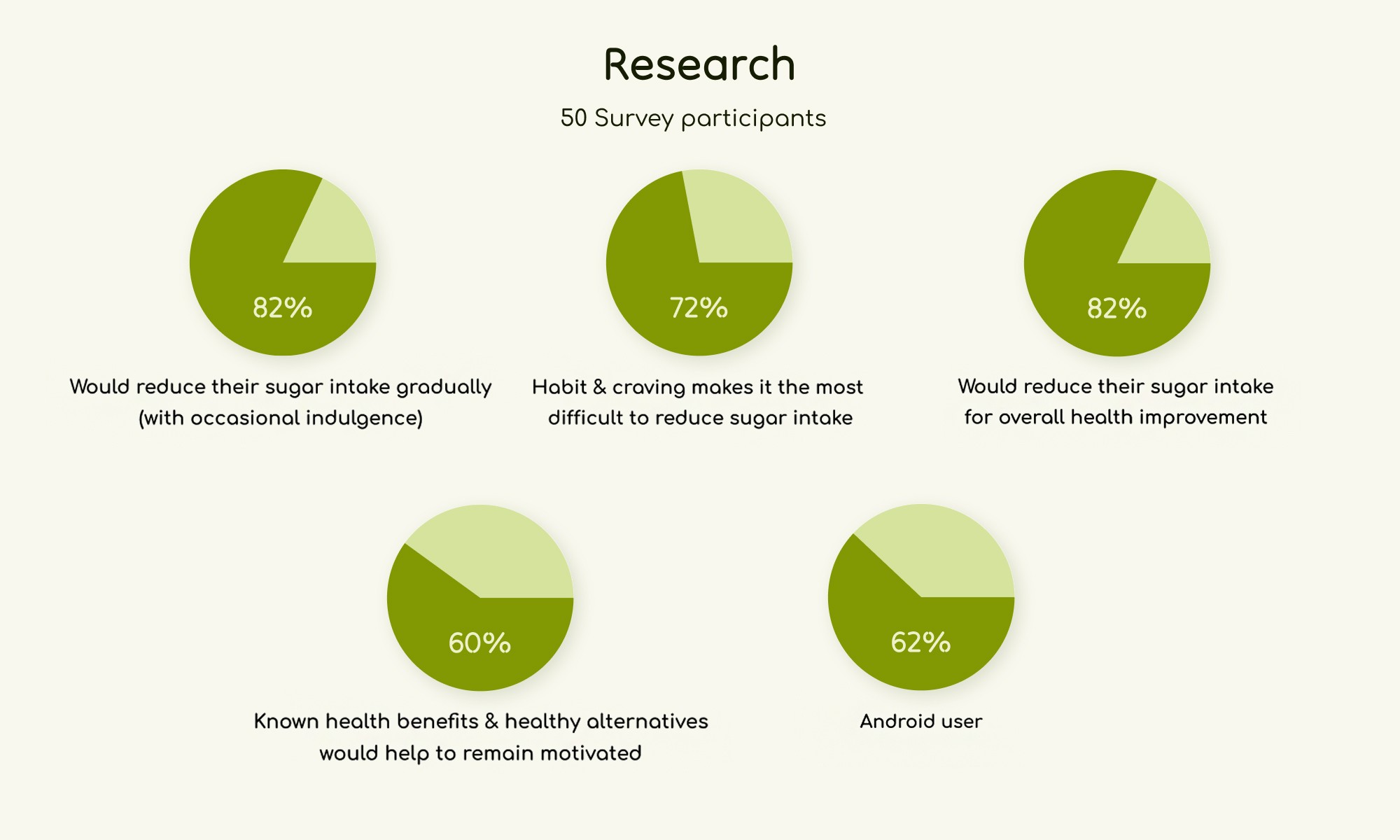
Research

We conducted interviews remotely with 8 participants and analysed a survey with 50 volunteers. We identified key insights that helped us better understand the needs of health-conscious persons:

  • It is not a good-bye: 82% would like to reduce their sugar consumption, but without quitting completely

  • Craving is the challenge: 72% find craving to be the most difficult factor when trying to reduce sugar intake

  • Overall health improvement is the main motivation for 82% of the survey participants

We categorized the gathered data with the Affinity diagram and we decided to put the focus of our project on help and motivation.
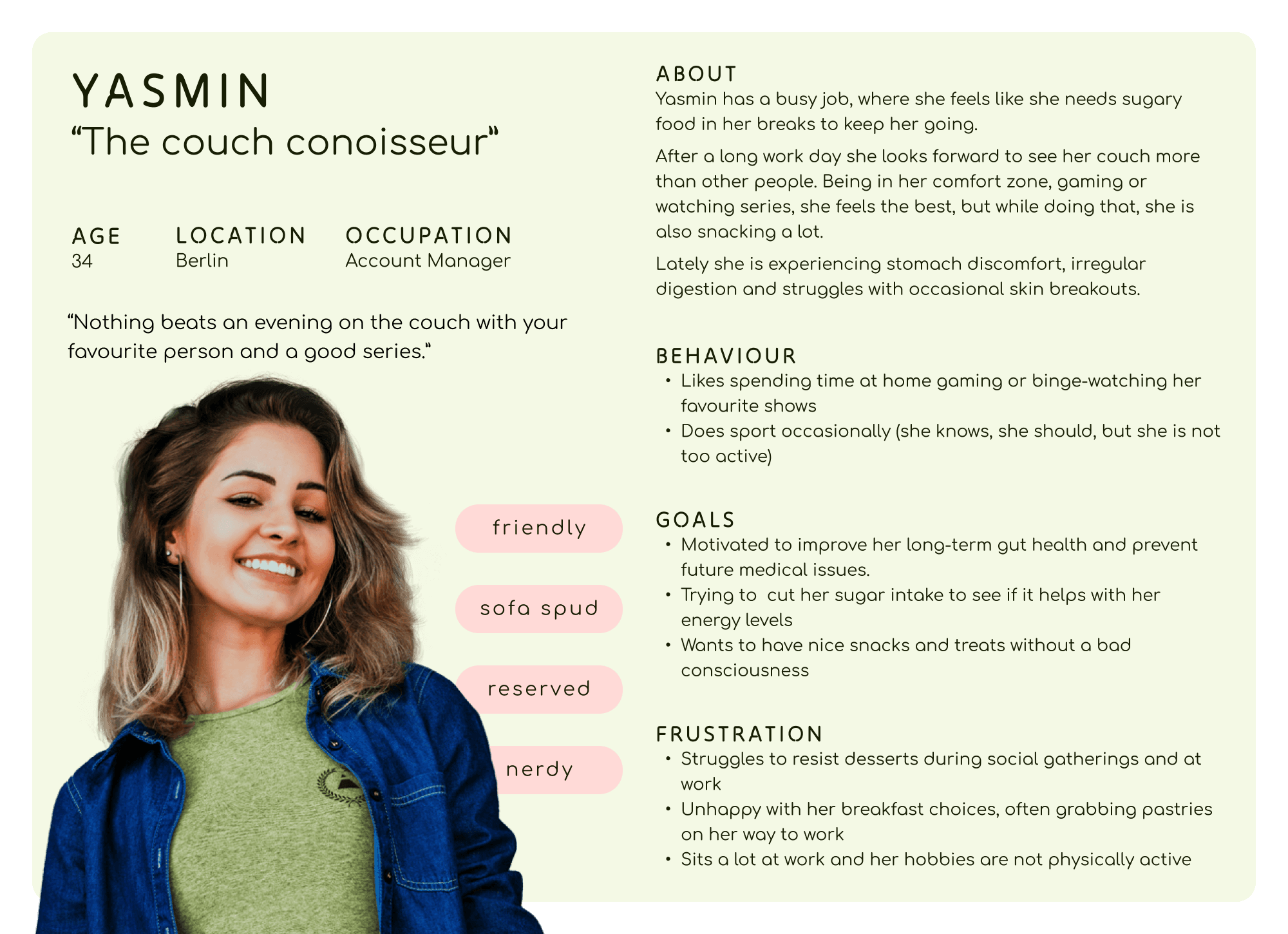
Key findings of the survey - Pie charts of the most important survey answers, among 50 persons. 82% of them would gradually reduce their sugar intake. Habits and cravings make it hard to reduce sugar and overall health improvement is the main motivation.

Persona

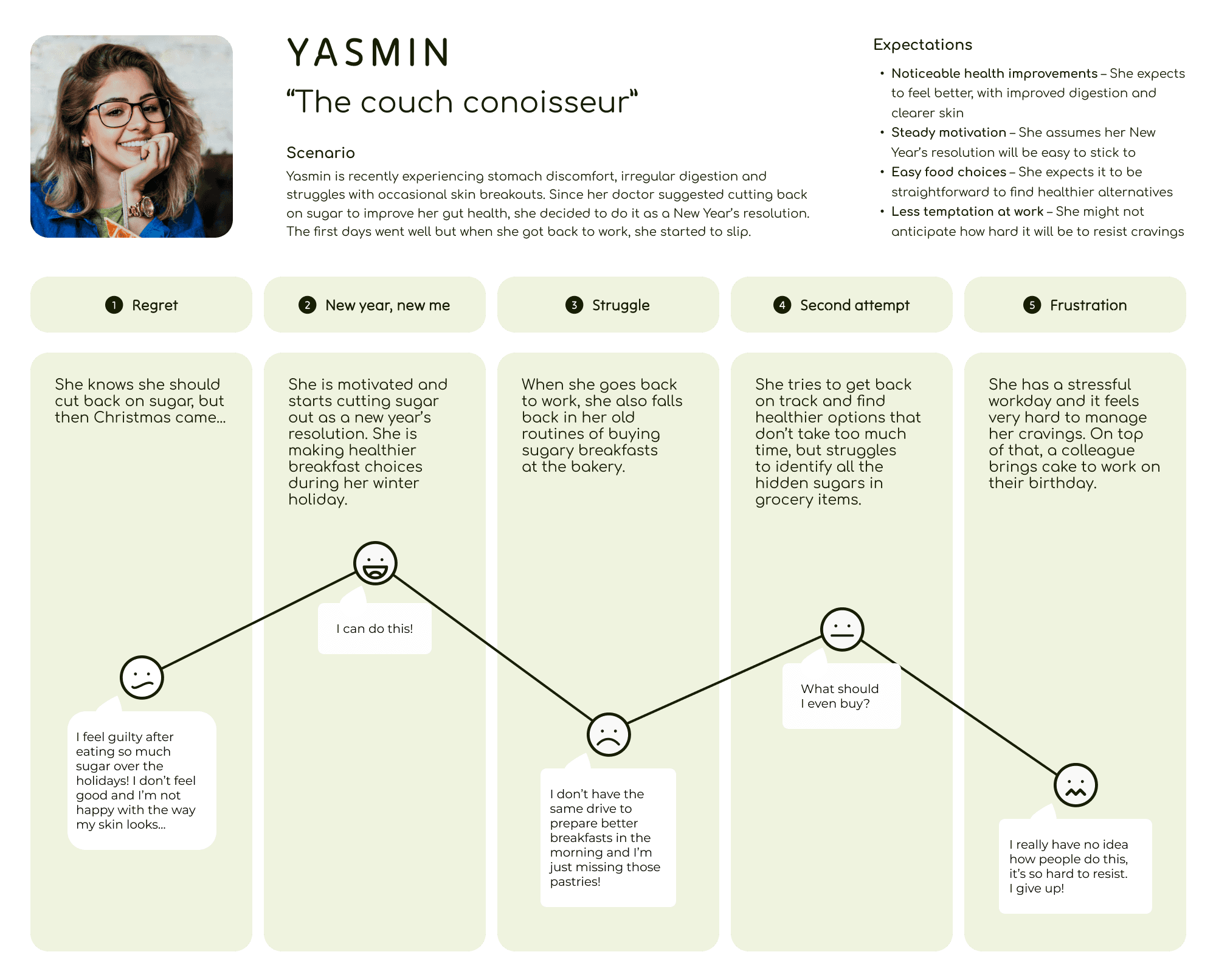
Based on the user research, our next task was to create a Persona representing our interviewees‘ needs, goals and observed behavioural patterns. Yasmin works as an account manager with a demanding schedule, often relying on sugary snacks during her breaks to stay energized. Lately she is experiencing stomach discomfort, irregular digestion and struggles with occasional skin breakouts.

A mockup of a Macbook for the about us page of the hair salon website

User Journey

Map

Her doctor suggested she reduce sugary foods to improve her gut and skin health, so she started a New Year's resolution. However, once she was back at work, she couldn’t resist her cravings and fell back into her old habits of snacking sweets.

Yasmin’s difficulty maintaining her sugar reduction goals

Problem

statement

Writing about her journey led us to understand her better and made us think about opportunities on how we could help her reach her goal; to maintain her commitment to reduce sugar consumption. We defined the problem statement to reflect the challenges:

“People who are thinking about reducing their high level of sugar intake need to find a way to maintain their commitment to reduce their sugar consumption because they often experience setbacks from temptations and cravings, which threaten their health progress.”

“People who are thinking about reducing their high level of sugar intake need to find a way to maintain their commitment to reduce their sugar consumption because they often experience setbacks from temptations and cravings, which threaten their health progress.”

MVP

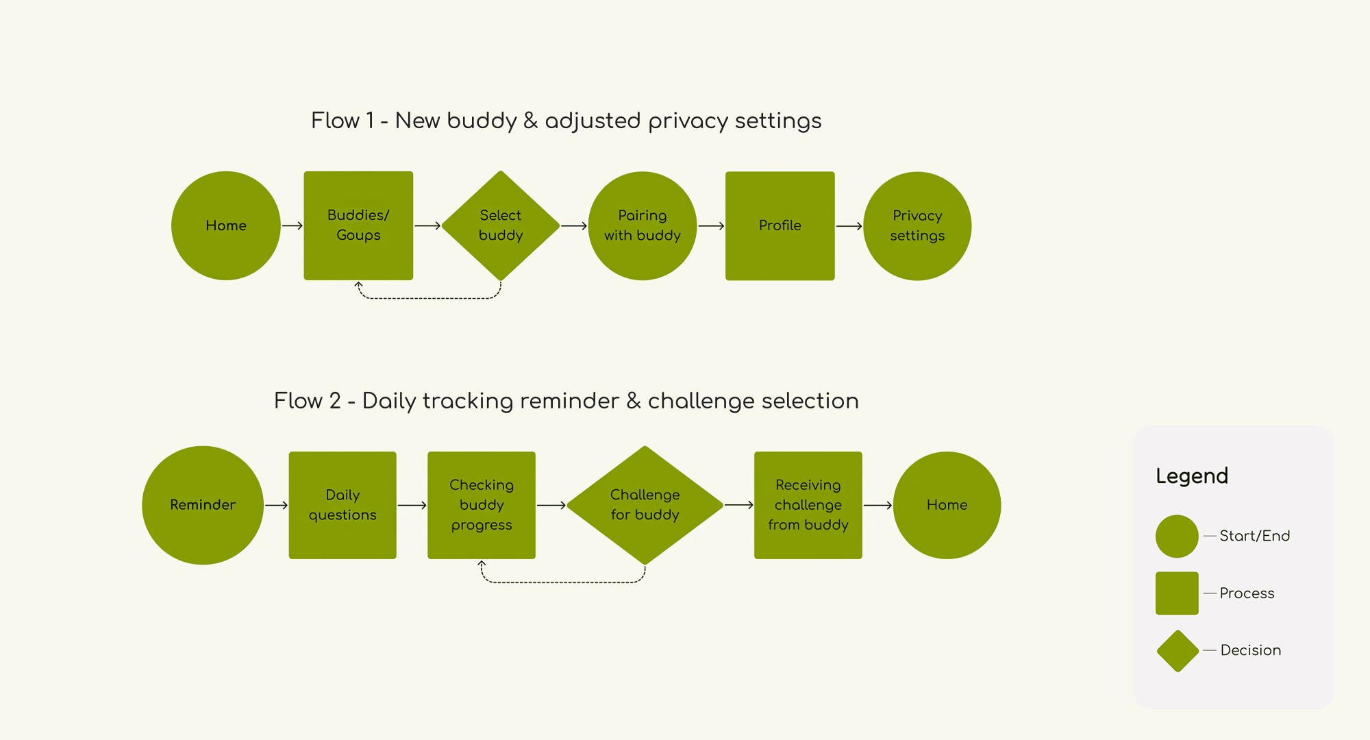
At a bare minimum, users should be able to define their sugar reduction goals, learn about their progress and remain motivated. When necessary, users should be helped with their cravings. They can further encourage themselves with given challenges they can do either by themselves, or with accountability partners. (I’ll refer to them as “buddies”.)

User flow

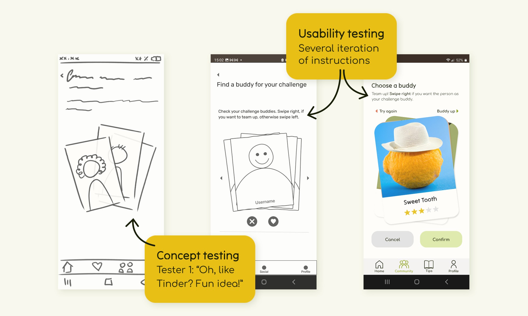
Creating the sitemap and user flow was challenging as we struggled to condense all our ideas. Concept testing revealed the prototype felt overwhelming, so we simplified the design. With guidance from our instructor, we eventually created two clear user flows, the first one guides the user through a buddy selection, the second one is about the daily questionnaire and how the user chooses a challenge for their buddy.

2 shorter userflows so necessary tasks can be completed easily. The first one presents the accountability buddy selection and privacy policy settings. The second one is about the ritual of daily tracking and the exchange of tasks among the two challenge partners.

Wireframes &

tests

Wireframes &

tests

Once all frames were done in mid-fidelity, we ran a couple of Usability testing together with Moodboard testing, so we applied all feedback in the same iteration. As the buddy selection in our app happens in a playful, gamified manner and there are specific swiping gestures involved with it, we focused on applying the feedback related to that interaction.

Buddy selection in low, mid and high-fidelity

Style tile

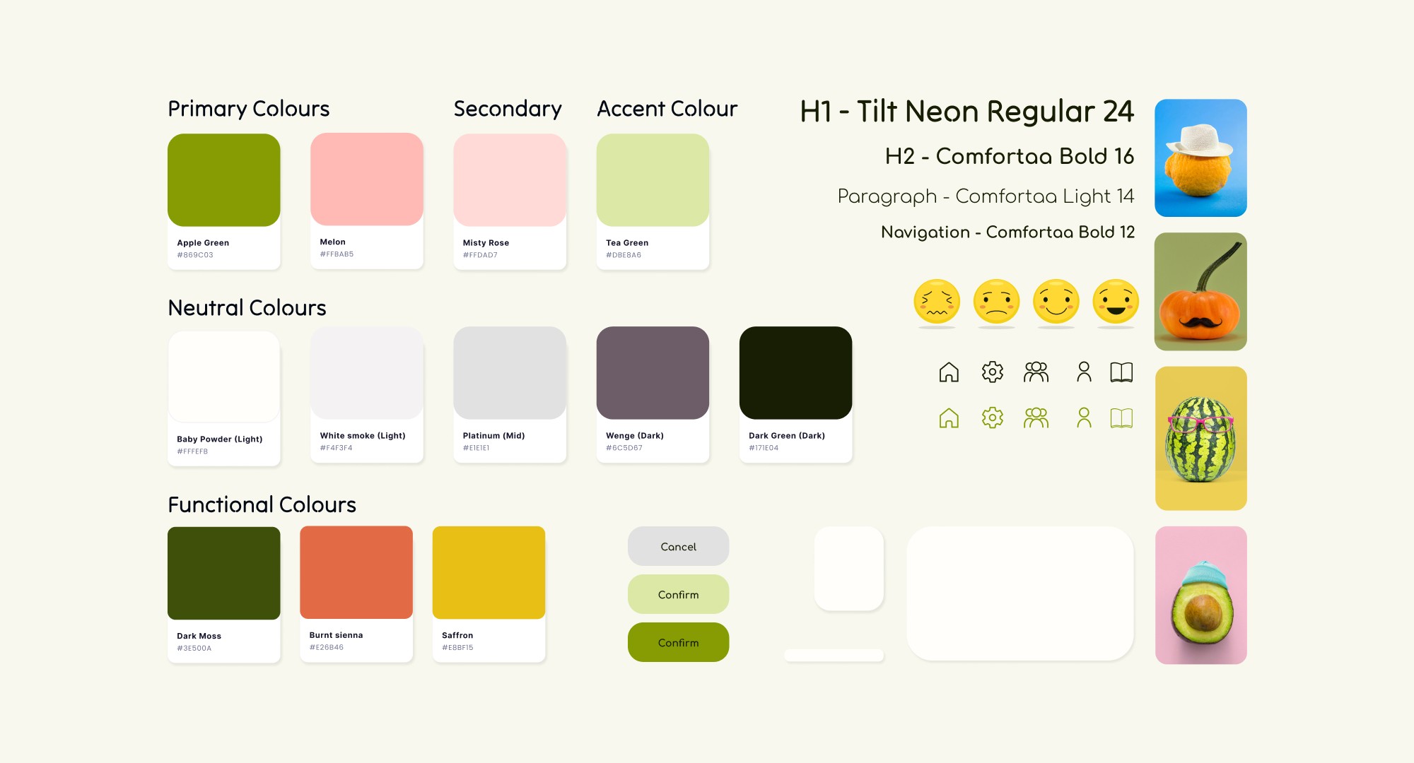
We wanted to emphasize optimism while keeping an eye on health and kindness, so we based our palette on greens and pink. Our sans-serif typefaces are playful but clean, with the kinds of details you might expect to see when the letter is built up with a brush.
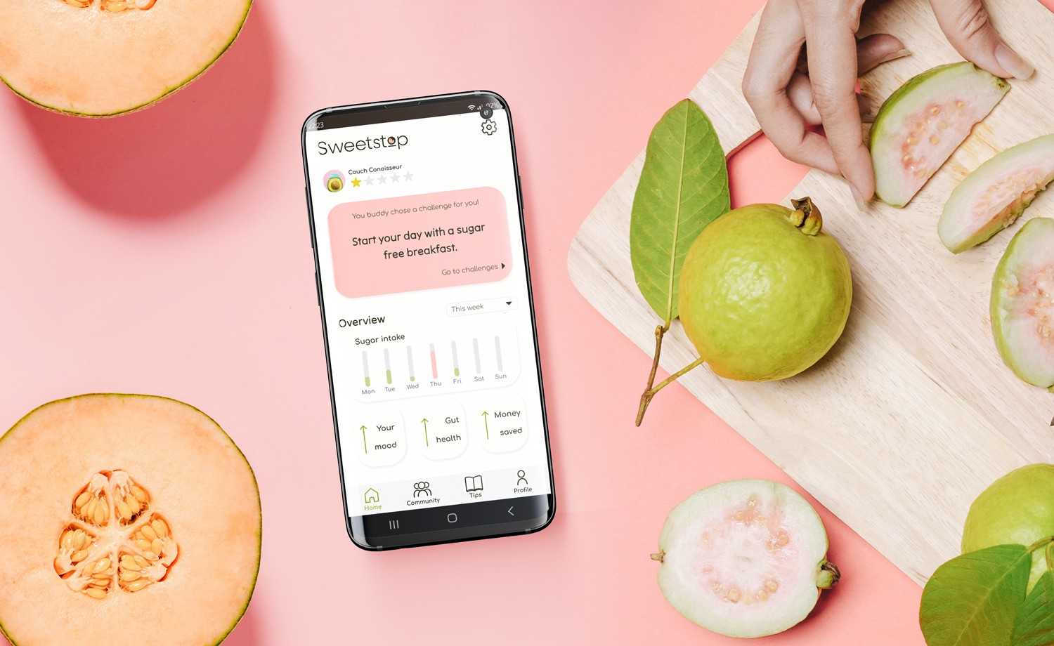
A style tile featuring tinted greens and pinks. Both typefaces are monolinear sans-serif, making them playful but not overly cartoony. The avatars are anthropomorphic produce images such as a lemon, pumpkin, watermelon and a half avocado to protect user privacy by avoiding the use of portraits.

High-fidelity

prototype

Translating the mid-fidelity prototype into high fidelity took more time and effort than anticipated. I wanted to create those little, rewarding micro-interactions on certain screens and I underestimated the hours needed for those. There is this fuzzy satisfaction when you use an app that just… works beautifully. Usually, it’s not the big features that create this feeling, but the small, delightful moments.

Upon gathering the final insights, we completed our high-fidelity prototype, ensuring that every element of the design seamlessly worked together. This process ensured that the design, usability and overall user experience were cohesive and intuitive.​​​​​​​


Conclusion

Teamwork: Looking back, I don’t think we had big challenges and the issues we faced in the moment were temporary.
MVP: We simplified our ideas and functionality, keeping the experience simpler and more cohesive. We found an unfulfilled, underserved gap on the market and I believe we came up with something viable during this 2-week sprint.
Next iteration: As the truth about sugar is not so simple, we would like to improve the overall knowledge about sugar with tips and informative articles.